Thursday, July 26, 2018

Top Creative Cutting Tips and Ideas to Enhance your Designs


Adding dimension is a snap when you begin to layer shapes cut from thin metal dies or SVG's. 

We offer both and the goal is to always create versatile cuts for all kinds of projects! Our design team has taken on this weeks' Creative Challenge by showing you how to do exactly that. You can see all of our thin metal dies and SVG's . 


DESIGN TIP:
I love working with SVGs because you can resize your image to suit your project. - Mercedes


DESIGN TIP:
Just because it's a flower doesn't necessarily mean it has to be green leaves and pink petals! Think outside the box! Monochromatic cards are quick and simple to create and can be just as easy to create with dies as they are with stamps! It's also a great way to use up any leftover cardstock. - Samantha
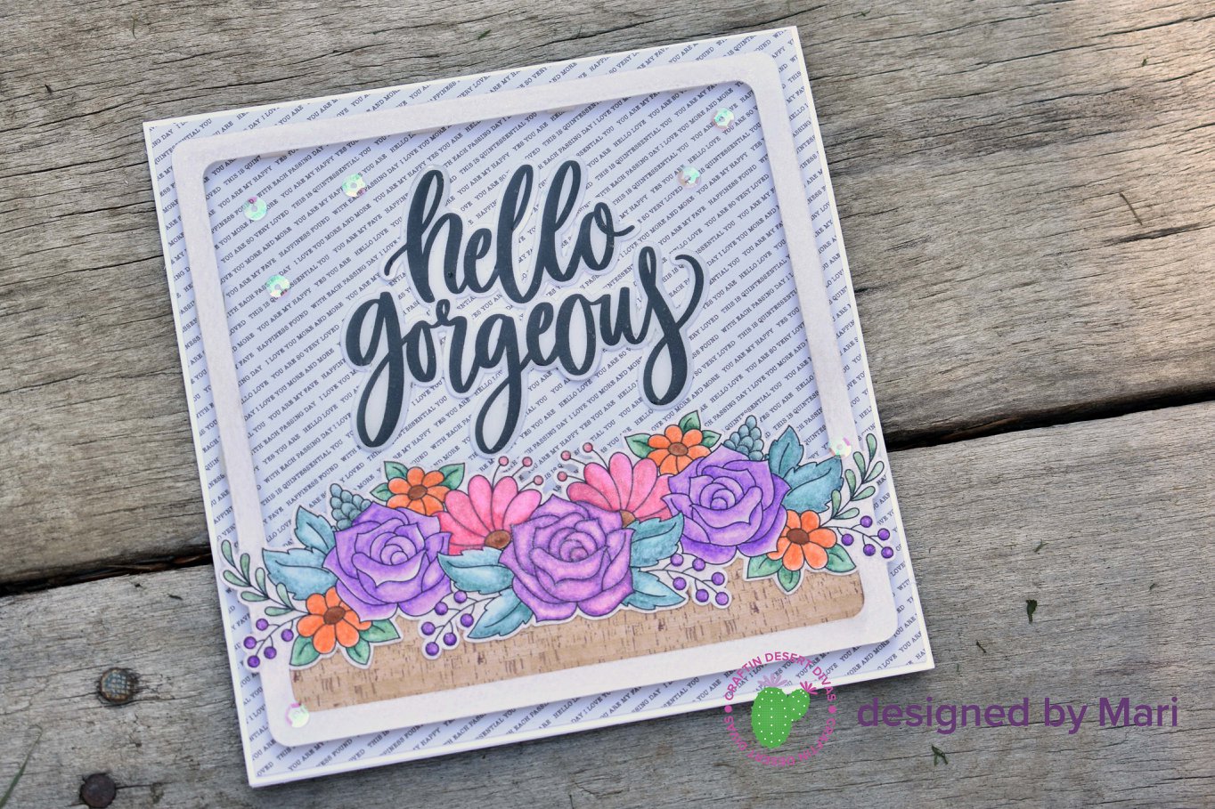
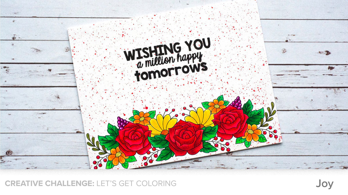
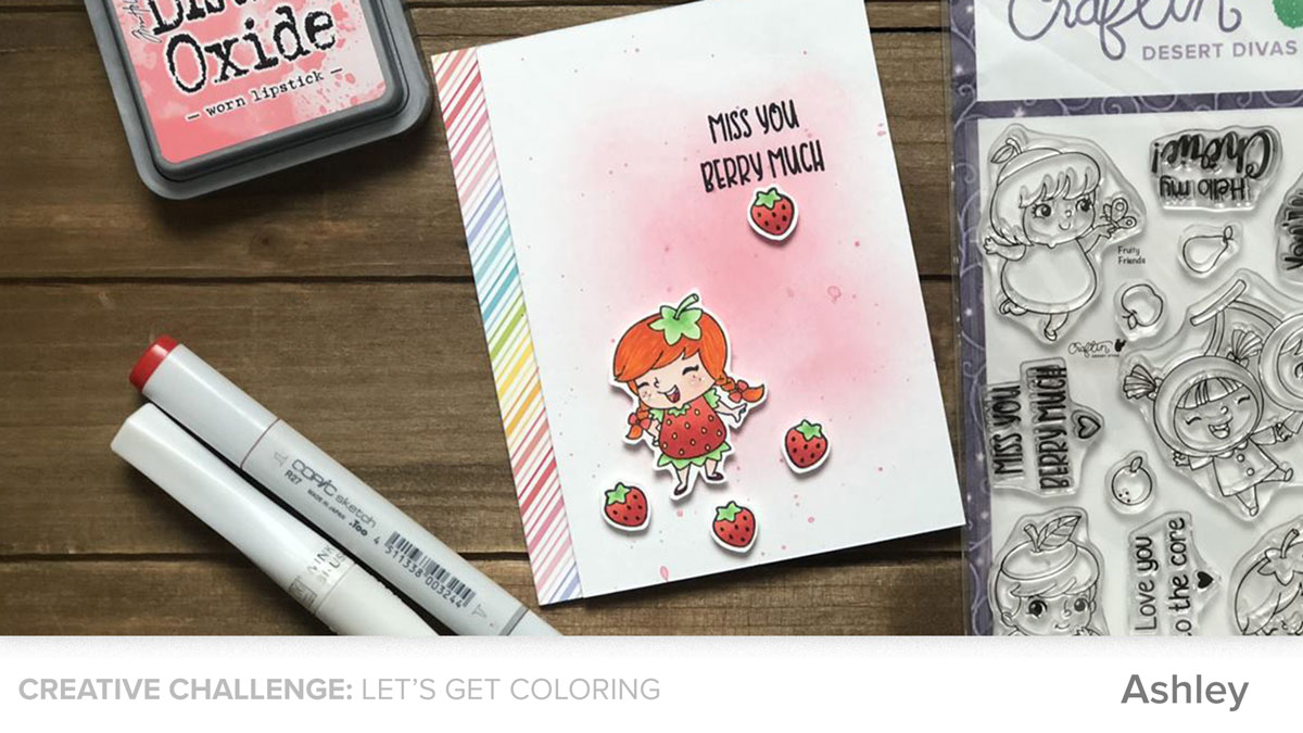
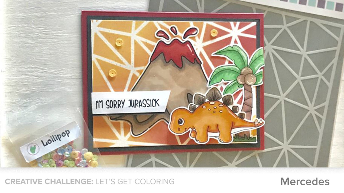
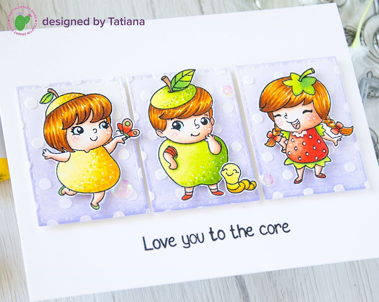
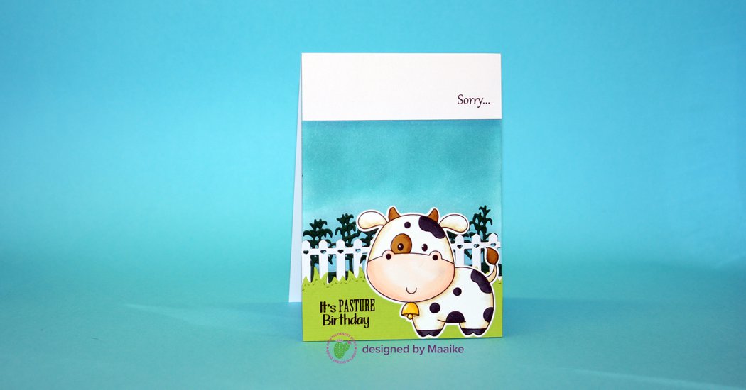

#6 - MARI


#7 - CHARLOTTE


What are your favorite ways to use die cuts? Let us know in the comments below!

Monday, July 23, 2018

How to Create an Easy Stained Glass Look with Copics: Step by Step with Saundra

Today you're in for a treat as Saundra shares a beautiful technique that creates a stained glass look with your favorite alcohol markers. The best part? No shading! We'll let her share how below.

--------
Hello CDD friends! I am so happy to be here with you today. Copic coloring can be a little intimidating so I thought I would share an easy way to use your alcohol markers with no shading required.


Supply List:

Fog cardstock
Vellum
Versa Mark Mini Ink Pad -
White Embossing powder
Powder bag
Heat Gun
Copic markers
Stamping positioner: I own the Misti and Tonic Studios Stamp Platform
Stamps: , 
Dies:
Sequins:
Foam tape
Liquid adhesive: 


Let’s get started!


STEP 1: Heat Emboss your Stamped Image

I started by stamping and heat embossing my flowers from the . When heat embossing you need a sticky ink so that your embossing powder will stick to it. The best ink for this is .

Before stamping use your powder tool or powder bag over the area to keep the embossing powder from sticking to areas you don’t want it.

You want to heat up your heat gun for a few moments before taking to the vellum. Move your heat gun around and don’t stay in the same spot for too long. If you have heated your gun long enough it will only take a few seconds for the embossing powder to melt.


STEP 2: Color the back of the vellum piece

Once the vellum is cooled, turn it over and color the other side. You want to color the side that hasn’t been embossed so that you don’t color your embossed lines and it gives the vellum a stained glass look. A great thing about coloring on vellum is you don’t have to do any blending. As you can see in the picture above I only used two Copic markers.


STEP 3: Cut out your images

Once the flowers were colored I fussy-cut them with my scissors.


My flowers needed leaves so I colored another piece of vellum with a green Copic markers and die-cut some leaves using the dies from the .


STEP 4: Create your design arrangement

Now it’s time to arrange everything onto the panel and see how it looks.

For my panel, I used the and heat embossed the medallion onto Fog cardstock as well as, the You sentiment. Momento London Fog ink was used to stamp the supporting sentiment.

Since I was happy with this placement I took a picture with my phone so that I could reference it as I glued all the elements down.

STEP 5: Adhere all your pieces onto the card panel

I carefully applied my onto the vellum pieces. Applying a small dot of glue in the centers of the flowers, on the stamen, and a tiny bit on some of the edges was the perfect amount and seemed to be enough to adhere the flowers. The leaves were tucked in under the flowers and the Sentiment was popped up with foam tape.


STEP 6: Add finishing touches.

For a finishing touch, I added a few .


I hope you found this helpful and gets you creating with your favorite Craftin Desert Divas products. Thank you for spending a bit of your time with me today! Let us know in the comment below if you'll be giving this technique a try soon. 

Partial Die Cutting Technique: New Video


In today's video, Elaine is going to share how to use the partial die cutting technique to create a beautiful card front using one die and also how to cut a new shape for a sentiment.  


Click the video below to watch on our .

SUPPLY LIST:

Thursday, July 19, 2018

Coloring Inspiration for Every Skill Level


What's the first thing you think of when it comes to coloring? 


Usually, most people would say "Time!" or "I'm not that great yet." For today's Creative Challenge, our designers wanted to share some quick coloring tips and ways you can practice and elevate your skill level - right where you are!


DESIGNER INSPIRATION IMAGES plus 

OUR DESIGN TEAM'S 13 BEST COLORING TIPS

#1 - ANNA

#2 - CLAIRE-ANNE

#3 - ELAINE

----

DESIGN TIP #1. Keep a swatch book

I always write new combos I like down in my Copic book, that way I can easily recreate my favorite looks. - Janni 
Whenever you buy new colors, be it inks, alcohol markers, pencil colors, watercolor pans/tubes, etc. the first step to do is to swatch them. That way you have the chart ready when you want to use them. - Joy

DESIGN TIP #2. Your paper matters

When using different coloring mediums, your type of paper really will make a difference. When using alcohol markers you want a paper that is slow-drying so you have time to blend the colors more. When working with watercolor pencils or markers you want the watercolor paper to allow the water to spread and soak up and not bleed on your image. - Candice

---- 

#4 - ASHLEE

#5 - JACKIE

#6 - JANNI

----

DESIGN TIP #3. Your ink matters, too

Make sure you use ink that is compatible with the type of marker you are using. Solvent inks will run if you are using Copic (alcohol) markers. Memento, Brilliance or Ranger Distress inks are best when using Copic Markers. - Claire

DESIGN TIP #4. Try heat embossing first

If you are a beginner, you can stamp and emboss the image with clear embossing powder. This helps you stay within the lines. I do use this trick most of the times. However, this does not work with alcohol inks/markers. - Joy 

---- 

#7 - NATALIE

#8 - CLAIRE

#9 - CANDICE

----

DESIGN TIP #5. Create your own method

When coloring with alcohol markers, my method uses just a few steps. First, I lay down a nice juicy foundation all over the segment I'm coloring with the lightest color. Then, I add the shades with the darkest, blend those out with the middle color and finally, I blend the middle with the lightest again. Sometimes I only use two shades. - Maaike

DESIGN TIP #6. Shading adds instant dimension

Adding shading to your paper piecing can really help it pop - a light grey alcohol marker will work to add shading on almost anything. - Charlotte

----

#10 - JOY


#11 - COURTNEY

#12 - MAAIKE

----

DESIGN TIP #7. Achieving the no-line watercolor technique

For no line watercolor technique, stamp the image using a light water soluble ink. If you do not have a lighter color, you can use the second generation stamping technique to get the same effect. Antique Linen Distress Ink is excellent for no-line watercolor. - Joy

DESIGN TIP #8. Test color combos first

Before you start coloring choose your favorite colors and test it on an extra piece of paper if the colors fit together. - Angela

----


#14 - MARI

#15 - ANGELA

----

DESIGN TIP #9. Experiment with different textures, mediums, and colors

Using two mediums can give you amazing results. When you use watercolors to color the image, you can add details with pencil colors or gel pens. - Joy 
Use a color wheel or color chart. Try mixing up new colors you would never think of using together. - Holly

DESIGN TIP #10. Highlights can make all the difference

When coloring hair with Copics, use light, varying flicks, barely touching the paper. Be sure to leave a highlight, and maybe even some white space. - Courtney

---- 

#16 - ASHLEY

#17 - HOLLY 

----

DESIGN TIP #11. Colored pencil favorite combos

If I color with Polychromos pencils my favorite paper is Neenah Solar white paper. My favorite pink colors: Fuchsia 123, Light Purple 128 and my favorite turquoise colors are Helio Turquoise 155, Cobalt Turquoise 153 and Light Cobalt Turquoise 154. - Angela

DESIGN TIP #12.  Keep your pencils sharpened and your eraser handy

It's also very important that your pencils are always good sharpened and you need a good eraser if you color over the lines. - Angela

DESIGN TIP #13. Make a palette for ink control

I use clear contact paper when applying distress inks. I ink up the applicator, then dab on plastic contact. This allows me to have control of how much I apply, have an even amount of ink on the sponge, and not waste any ink. - Michelle

----

# 19 - MERCEDES

----

CDD Design Team's 13 Best Coloring Tips

----

DESIGN TIP #1. Keep a swatch book

I always write new combos I like down in my Copic book, that way I can easily recreate my favorite looks. - Janni 
Whenever you buy new colors, be it inks, alcohol markers, pencil colors, watercolor pans/tubes, etc. the first step to do is to swatch them. That way you have the chart ready when you want to use them. - Joy

DESIGN TIP #2. Your paper matters

When using different coloring mediums, your type of paper really will make a difference. When using alcohol markers you want a paper that is slow-drying so you have time to blend the colors more. When working with watercolor pencils or markers you want the watercolor paper to allow the water to spread and soak up and not bleed on your image. - Candice

DESIGN TIP #3. Your ink matters, too

Make sure you use ink that is compatible with the type of marker you are using. Solvent inks will run if you are using Copic (alcohol) markers. Memento, Brilliance or Ranger Distress inks are best when using Copic Markers. - Claire

DESIGN TIP #4. Try heat embossing first

If you are a beginner, you can stamp and emboss the image with clear embossing powder. This helps you stay within the lines. I do use this trick most of the times. However, this does not work with alcohol inks/markers. - Joy 

DESIGN TIP #5. Create your own method

When coloring with alcohol markers, my method uses just a few steps. First, I lay down a nice juicy foundation all over the segment I'm coloring with the lightest color. Then, I add the shades with the darkest, blend those out with the middle color and finally, I blend the middle with the lightest again. Sometimes I only use two shades. - Maaike

DESIGN TIP #6. Shading adds instant dimension

Adding shading to your paper piecing can really help it pop - a light grey alcohol marker will work to add shading on almost anything. - Charlotte

DESIGN TIP #7. Achieving the no-line watercolor technique

For no line watercolor technique, stamp the image using a light water soluble ink. If you do not have a lighter color, you can use the second generation stamping technique to get the same effect. Antique Linen Distress Ink is excellent for no-line watercolor. - Joy

DESIGN TIP #8. Test color combos first

Before you start coloring choose your favorite colors and test it on an extra piece of paper if the colors fit together. - Angela

DESIGN TIP #9. Experiment with different textures, mediums, and colors

Using two mediums can give you amazing results. When you use watercolors to color the image, you can add details with pencil colors or gel pens. - Joy 
Use a color wheel or color chart. Try mixing up new colors you would never think of using together. - Holly

DESIGN TIP #10. Highlights can make all the difference

When coloring hair with Copics, use light, varying flicks, barely touching the paper. Be sure to leave a highlight, and maybe even some white space. - Courtney

DESIGN TIP #11. Colored pencil favorite combos

If I color with Polychromos pencils my favorite paper is Neenah Solar white paper. My favorite pink colors: Fuchsia 123, Light Purple 128 and my favorite turquoise colors are Helio Turquoise 155, Cobalt Turquoise 153 and Light Cobalt Turquoise 154. - Angela

DESIGN TIP #12.  Keep your pencils sharpened and your eraser handy

It's also very important that your pencils are always good sharpened and you need a good eraser if you color over the lines. - Angela

DESIGN TIP #13. Make a palette for ink control

I use clear contact paper when applying distress inks. I ink up the applicator, then dab on plastic contact. This allows me to have control of how much I apply, have an even amount of ink on the sponge, and not waste any ink. - Michelle

---- 

We hope this helps you get into the coloring groove! 

Thanks for stopping by! And thank you to each designer for sharing your knowledge and talent with us all.

Leave a comment below and let us know which cards or tips inspired you the most.

    Monday, July 16, 2018

    Fruity Friends - One Set Four Ways with Tatiana


    Today on the blog, Tatiana will be sharing one of the newest Craftin Desert Divas Sets, Fruity Friends, four different ways! This new monthly series will show you how to take one of our sets and stretch it for more than one occasion or style.

    --------
    I'm so thrilled to be on the Craftin Desert Divas blog today with a special post featuring brand new and sooooooo adorable stamp set from the Craftin Desert Divas new July Release!!!

    This is a jam-packed post filled with lots of pictures so let's start with the first card colored with Copic markers.

    Card #1


    I chose some cute fruity characters from set and stamped them with a . Next, I proceeded with coloring and finally fussy cut everything with , leaving a little white edge around.

    The complete list of Copic markers used on Card #1: 

    Skin E0000-E01-E02-E11-R20; YG00-YG01-YG13-YG25-YG95; R02-R05; 
    Hair Y21-YR24-YR29-E39; Y11-Y15-Y17-YR24; E33; BG00.


    Working on the layout, I die-cut three stitched frames from , added a soft coat of Distress Oxide ink and a fun dotted pattern through Sorted Shapes Stencil with a plain .


    Card #2


    Next, we have a soft watercolor scene.


    I switched to a Bristol paper and stamped a few adorable girls from along with some small images from stamp sets with a .


    Before coloring, I also prepared some die cuts for the background using the same Bristol paper, and .


    Finally, I could enjoy watercoloring the whole card with watercolor pencils from Prima. "The Basics" 12 piece set was more than enough for this card since you can stretch any color and create a variety of shades by adding less or more water.


    Card #3

    My third example is this colorful and bright shaker card.


    Again, I started with a Bristol paper and a . The Zig Clean Colour Real Brush markers gave a totally different look to this card since they have incredible, juicy colors.

    Here's the complete list of all the colors used:

    n.51 Lemon Yellow - n.50 Yellow - n.25 Pale Pink - n.26 Light Pink - Peach Pink - Dark Pink - n.40 Green - n.46 Mid Green - n.71 Flesh Colour - n.61 Light Brown - n.64 Oatmeal


    Assembling the shaker part, I prepared a watercolor background and filled the circle window with mix.


    Card #4

    Last but not least, I created a colorful fruity background using small stamps from set. I love to play with small stamps and give them the main focus on my cards. A patterned background is one of the easiest ways to do that.

    I stamped a whole bunch of images on a watercolor paper, took my regular watercolors and tried to make a non-perfect (even a bit splotchy) watercolor look. 

    Next, I decided to transform my pattern into a scalloped circle card with and added the heat embossed sentiment from the same set on a fish-tailed banner.


    I hope this post inspired you to stretch your craft supplies and get more use of the same stamp set. There are so many ways to use these sweet images!

    Leave a comment below letting me know what your favorite card was in this post. Thanks so much for stopping by and have a fabulous week!

    The full supply list for this post is linked below.


    ZIG MARKER COLOR LIST:

    n.26 Light Pink - n.51 Lemon Yellow - n.50 Yellow - n.52 Bright Yellow - n.70 Orange - Peach Pink - n.23 Scarlet Red - n.45 Pale Green - n.31 Cobalt Blue - n.42 Turquoise Green - n.32 Persian Blue - n.63 Lilac - n.82 Purple - n.71 Flesh Colour n.62 Mustard - n.64 Oatmeal - n.61 Light Brown - n.91 Light Gray

    ALL SUPPLIES USED:


    Newer Posts Older Posts Home